Oregon Releases LiDAR Data and Map Series
This week the Oregon Department of Geology and Mineral Industries (DOGAMI) released a new digital map series and a new digital data series featuring LiDAR data collected in the Portland Metro area by the Oregon Lidar Consortium. Details about the release are available in a press release [PDF] and on their new LiDAR Publications page.
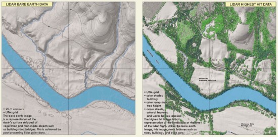
The Lidar Imagery Series (LIS) publications are PDF format maps showing bare earth and first return ("highest hit" in DOGAMI parlance) surfaces. 20 ft contours are shown on the bare earth images while the "highest hit" surface has the vegetation colored by height. Both maps are quite attractive and appear positioned to replace the iconic USGS 7.5 minute quad maps. Each LIS quad map costs $30 and can be ordered on CD ROM.

Although the LIS maps are pretty, more exciting is the actual data that was used to generate the maps. DOGAMI is releasing these data as Lidar Data Quadrangles (LDQ) where each quad includes bare earth, first return and intensity images of the data. Unfortunately, these data are not available for direct download and instead must be ordered on DVD at a rate of $200 per 7.5 quad. The good news is that DOGAMI has made the all point cloud data available for free via the NOAA Topographic Change Mapping site and therefore it is possible to access custom gridded products in addition to the point cloud data.
UPDATE (08/27/09 @ 12:40 PM):
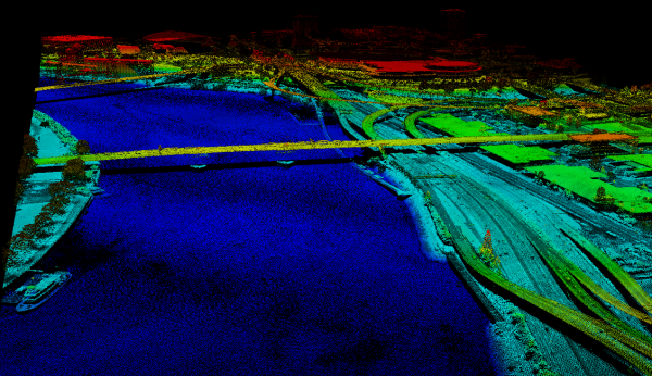
I ran a few quick jobs on the NOAA Topographic Change site to extract some of the new DOGAMI LiDAR data. Below is point cloud data for the Willamette River through downtown Portland, OR. The bridge in the center of the image is the Burnside:

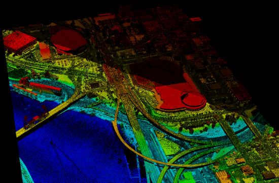
It appears there may be an intensity calibration issue with these data based on the fact that the intensity of the points in the distance in the image are significantly darker than those in the foreground - the intensity difference appears to be along a tile edge - here is another look :

UPDATE: Ian Madin at DOGAMI reports that this intensity difference is due to the fact that there were two different sensors in use during the survey: "Some of our data was flown with an Optech and Leica sensor, and the intensity images from those overlap areas often show significant differences. The Optech also produced noisier data which shows up in a slopeshade map of the same area"
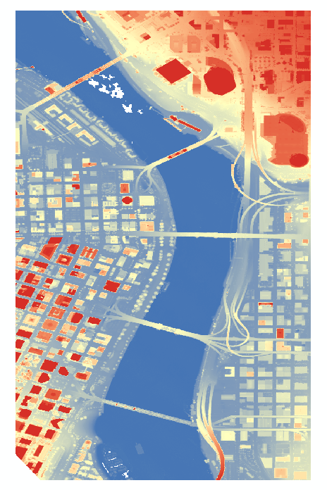
2 meter first return DEM of the same data that I also generated via the NOAA site:

